I came across an ad today for a typeface that mentioned ‘Didone’.
Didone is a typeface category recognized by the Association Typographique Internationale (AtypI), and part of the VOX-ATypI classification system.
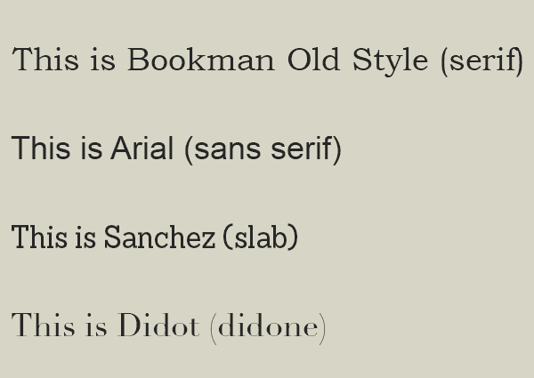
It emerged in the late 18th century. The category is also known as modern or modern face, in contrast to old style serif, which dates to the late medieval era.
Didone is characterised by:
Straight (hairline) serifs without brackets.
Vertical orientation of weight axes. (The vertical parts of letters are thick.)
Strong contrast between thick and thin lines. (Horizontal parts of letters are thin in comparison to the vertical parts.)
An unornamented, “modern” appearance.
You may recognise the Didot typeface, and the name is obviously linked with the typeface category. It’s not a coincidence. Again referencing Wikipedia:
Didot is a name given to a group of typefaces named after the famous French printing and type producing family. The classification is known as modern, or Didone.
Take a look at the Wiki entry – it talks about the CBS logo that used the font for years.

Leave a comment