When I was in conversation with front-end web developers trying to describe a certain kind of website appearance that I liked, I would name those that I had in mind.
One of them was A List Apart. I liked the overall effect of the pages very much.
It’s hard to say why. I think many visual effects operate at a level that defies being explained aloud.
Be that as it may, a while ago I looked at A List Apart, and it had changed. It was now 21st century with a capital S (for SHOUT). I can’t take the new appearance. I feel like I have to stand up and walk back a few paces so that the page is less in my face.
Who reads A List Apart? Well, as it describes itself – ‘For People Who Make Websites’.
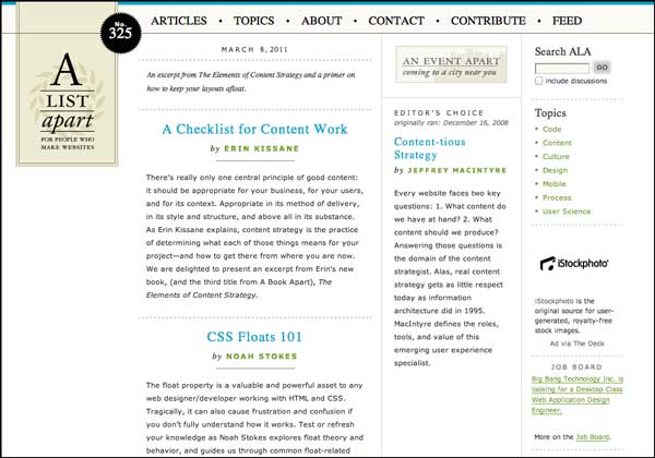
I made a screen grab of the old style page and chose to grab it at 1,000px wide by 700px tall. But with the new design, even 1,000px wide couldn’t grab the whole of the page as it displays on my Macbook Pro.
Who Gives A..?
I do. I think the new design looks bad. I think it’s uncomfortable to read.
Please take a moment to look at A List Apart (the link opens in a new window/tab) – because you really have to see it full size to understand what I mean – and maybe let me know what you think?

How I Found The Old Page
The Web Archive doesn’t store everything on the web, but it stores a lot of sites and a lot of pages. The page I grabbed is from a random date in 2011, but for a popular site like A List Apart, there were many from which to choose.
Update
I just clicked a link on the A List Apart site, and it goes to A Book Apart. Strangely, that page is more in the old style of the site.

Leave a comment