I was in a cafe and noticed a postcard from the builder on the counter asking for feedback on the construction of the building.
I couldn’t help but wonder what the builder would do if everyone said the same thing about how the construction should be changed.
In fact, the building is very pleasant in that 21st century way that speaks of life being cleaner there in the building. Clean and better insulated there from the difficulties of life outside.
I think that is why people like Starbucks. It passes on a bit of its chic to us and we can live in that cocoon for a little while. It’s certainly part of the reason I go there – that and the coffee (and the fritters).
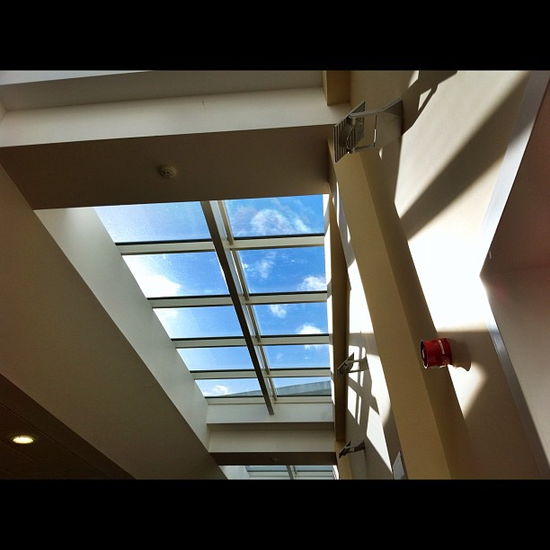
So, I looked up in the cafe to examine the building and saw the framing of the sky in the skylights.
I used my iPhone to capture the image. I took one shot using Camera + and then another photograph using Pro HDR.
The shot here is the Pro HDR shot, which captured a greater contrast range that suited the image.
I am not a big fan of over-the-top High Dynamic Range images. But Pro HDR has sliders that allow you to manually adjust the brightness, contrast, saturation, warmth, and tint. And unlike ‘Fake HDR’ apps that only use one image and then fudge it – Pro HDR takes two exposures, which enables it to take advantage of the full dynamic range in the scene.
You do need to hold the camera steady for the two shots, but they follow on pretty much one after the other after the app has analysed the lighting.

That is pretty neat! I agree with you on your thoughts about Starbucks. That’s how it feels.
Wouldn’t have imagined that any kind of HDR was applied to that. Usually people tend to do too much, but sometimes just a little is nice too.
I like the new look and feel of this page 🙂
LikeLike
Thanks – It’s the new WordPress Sundance theme. I made the background in PatternCooler and then altered the hue in Photoshop to make it fit with the tone of the theme.
LikeLike
I’ll have a hard time changing theme now that I’ve found the one I have … I really like the crumbled paper background in the comments-replies LOL
LikeLike
I just discovered that with this theme (Sundance) it is possible to change the outer wrapper colour or the inner background colour, but not both at the same time. Adding a background image knocks out whatever inner page background colour one chooses. I can live with that – every theme has its quirks.
LikeLike
I love the way you’ve captured the sun on the wall as well as the contrast of the sky. It’s great to come across your blog from The boy and me, I’m off to look at your other photo site!
LikeLike
Thanks. That was an added bonus of using HDR that could cope with the contrast range between the walls and the skylights.
LikeLike
great clarity on that one
LikeLike
Thanks 🙂
LikeLike
Great entry for contrast 🙂
LikeLike
Thanks for that 🙂
LikeLike
You hit the nail on the head for contrast!!
LikeLike
Can’t quite believe that’s taken with an iPhone, it’s SLR quality! The lighting and lines are stunning.
Thanks for linking up!
LikeLike
Thanks. The Pro HDR app for the iPhone is very good, as is the Camera+ app.
Yes, there are lots of conditions (very low light, for example) where an SLR outshines a camera phone many times over. But with the right subject and the right conditions…
I am going to put another shot up that I think shows the capability even more. Watch this space 🙂
LikeLike